DESIGNLAB
UX | UI
Adding a feature to make conducting user research delightful
Project Overview
BACKGROUND
Conducting and participating in research is a crucial part of a UX education. However, Designlab’s Discord-based system for posting and finding research opportunities is not ideal and can be improved to better meet the needs of its students.
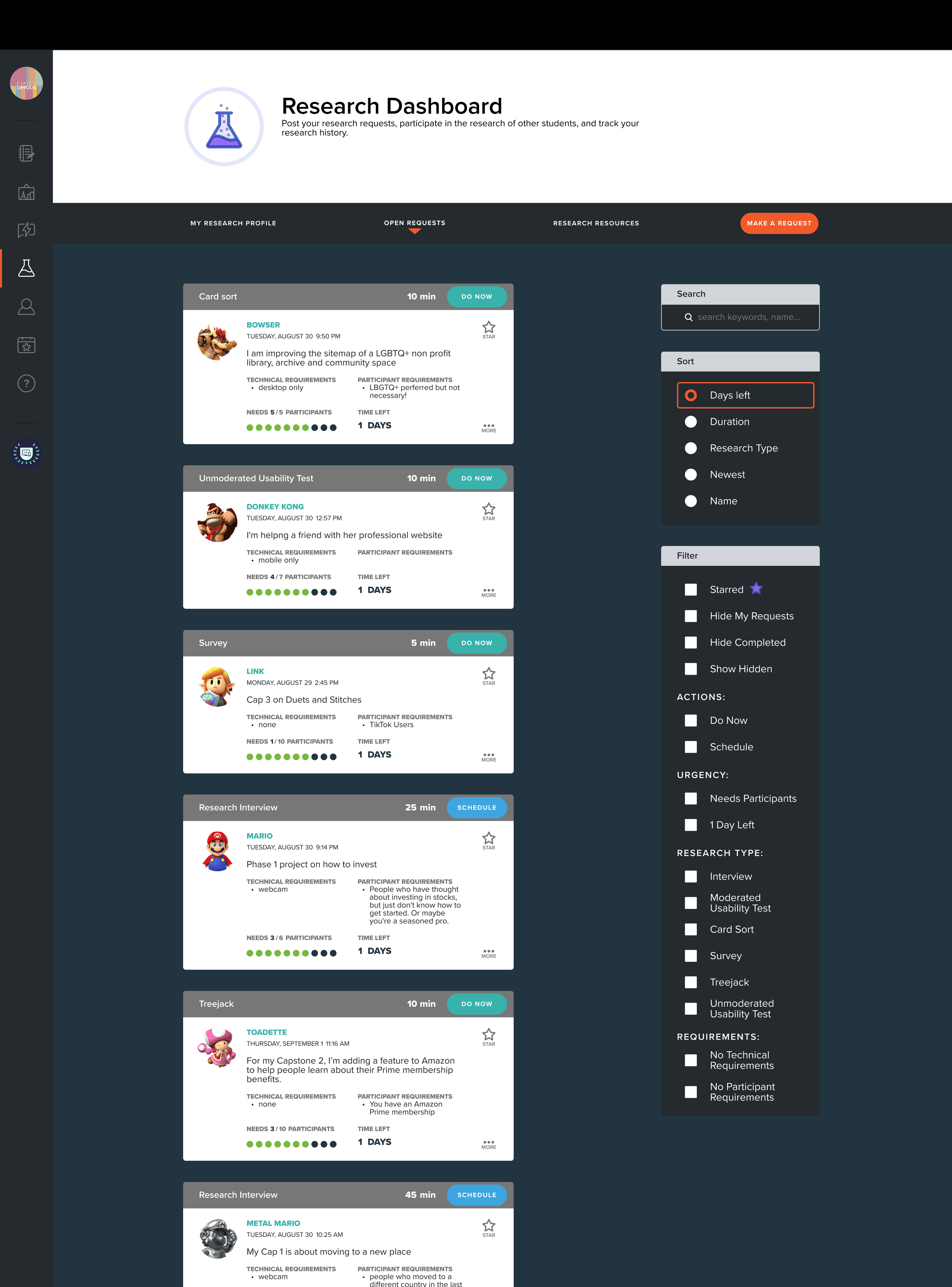
To address this problem, “research” is given its own page on the Designlab student portal, where students can search, filter, and sort open research requests from other students and submit and edit their own.
PROJECT TYPE
TOOLS USED
Adding a feature to an existing product
Student Project
Figma
FigJam
Google Sheets Sync
TIMELINE
ROLES
80 Hours
4 weeks
UX Designer
UI Designer
MAIN TASKS
Standardize the way Designlab students make requests for research participants
Make research requests uniform, searchable, and sortable
PROBLEM STATEMENT
How can we create a system within the Designlab dashboard that makes both finding research participants and volunteering as a participant simple and delightful?
The Process
1
2
3
4
5
6
7
1
RESEARCH THE USER
Current Design Analysis
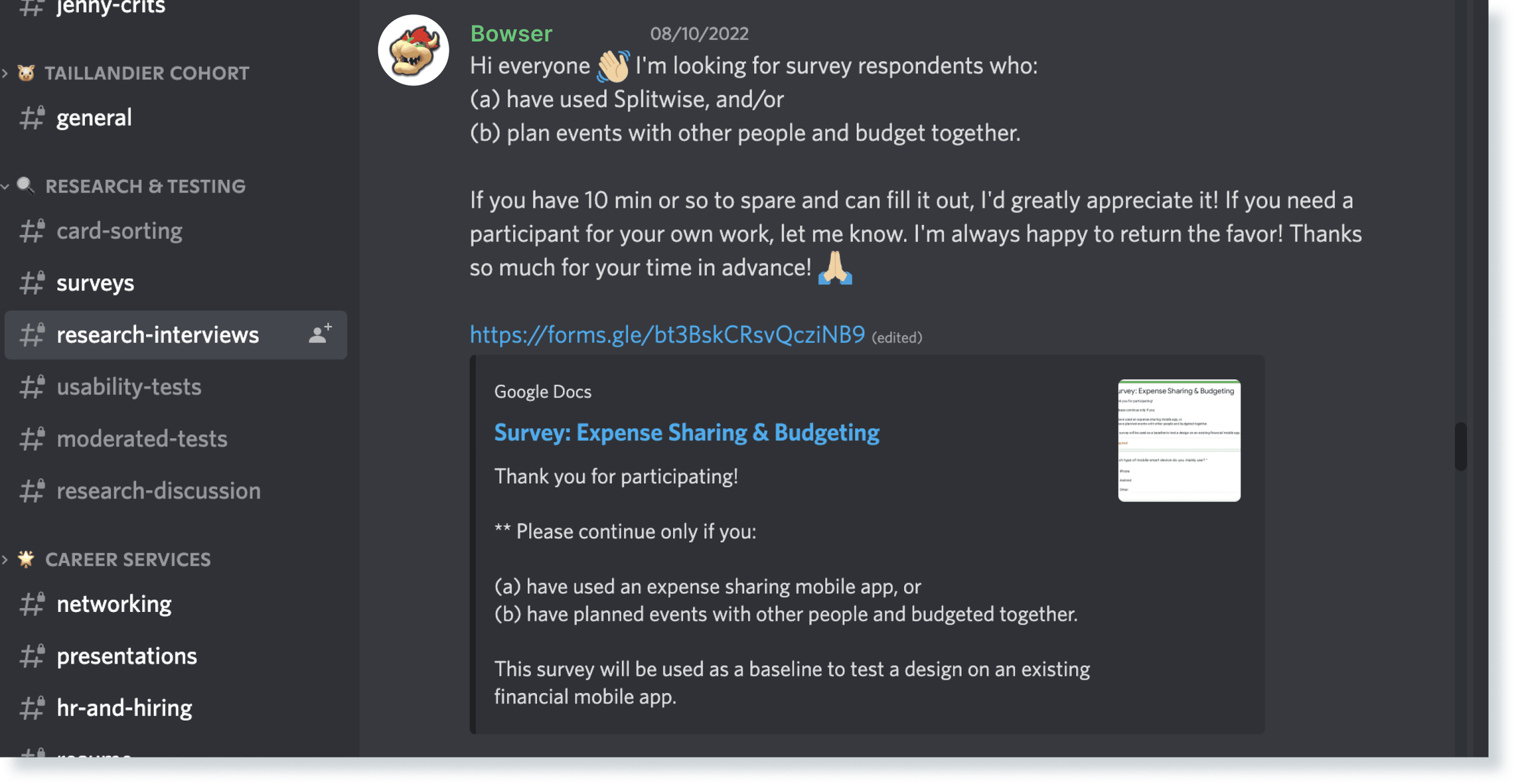
First I went into the research request channels on the Designlab Discord server and documented posts that I felt were representative of common problems.
These two requests look almost exactly the same, but they’re not! It would be easy to skip Luigi’s if you’ve done Mario’s.
Peach wants to be able to filter out people for her card sort.
Yoshi built in their own favor-returning mechanism! Go Yoshi!
Toad and Donkey Kong “should” have posted in the “moderated tests” channel, but
1. if you need to get these tests done, you’re going to post wherever you think people are going to see your request.
2. The channel separations rely on the user to make that distinction and get it right the first time- this is a lot to ask from someone who isn’t really a stakeholder in the “proper” organization of the channels.
Wrong channel, but can you blame him?
King Boo really just needs us to share his request with our own networks- but there’s no language/user flow for that.
Strikethroughs are how people indicate that they no longer need participants, but not everyone does this, so it’s difficult to understand what’s open and what’s closed.
It’s common for people to trade research requests, but they inevitably have to “spam” the chat, making it difficult to differentiate between new surveys and those that are being reposted.
Link is offering a gift card to participants- I think he would get more takers if there were more eyes on his request.
This channel for discussing research is an excellent example of what Discord does best, providing a place to share ideas and talk about what we’ve learned.
While using Discord to post research requests to the community is adequate, it is not ideal for a number of reasons.
KEY TAKEAWAYS
The current system depends on users to choose the correct channel for their type of request, and they often end up posting in the wrong channels.
Discord’s strength is discrete channels for different topics, but in this case, that means that a very small portion of the Designlab community is looking at the research request channels every day.
There is an informal “quid pro quo” system within the community for trading research requests, but there is no mechanism for trading requests without spamming the chat.
While studying the Discord, I also collected some feedback from my classmates about the current system.
Now that I had listed out what I thought needed to be improved, it was time to ask my classmates what they thought.
User Interviews
I spoke with some of my fellow Designlab students about their experiences both looking for research participants and participating in other students’ research.
I had extended interviews with 3 of my classmates and more informal chats with a number of others.
Many brought up the same points, mainly that finding research participants for their projects feels unnecessarily stressful and time-consuming.
KEY TAKEAWAYS
Users all mentioned that not enough of the community regularly looked at the research request channels to make posting there effective.
There was a general consensus that more organization is needed- users had difficulty separating open and closed requests, and wanted a way to search, sort, or filter requests.
Users also mentioned how there isn’t really a flow available for a different kind of request, like asking classmates to reach out to their networks for a particular kind of participant.
Many students agreed that doing other students’ interviews and user tests are a valuable use of their time and a great way to network and improve their UX skills.
With this research, I could now start to define who this feature would serve and how it needed to function.
2
DEFINE THE PRODUCT
User Overview
With my research, I could map out who this feature needs to serve.
PRIMARY USERS: RESEARCH REQUESTORS
Success Looks Like:
Easily finding participants for user interviews and moderated user testing for student projects
Networking and making friends within the Designlab community
Current Challenges:
There are not enough eyes on research requests. Many, if not most, Designlab students do not check the Discord server every day, and an even smaller portion look at the “research requests” channel regularly
SECONDARY USERS: RESEARCH PARTICIPANTS
Success Looks Like:
Learning interview and testing techniques from other students
Building a list of people who you can call on to participate in your research
Networking and making friends within the Designlab community
Current Challenges:
It’s difficult to figure out at a glance on Discord if you’re eligible for research or if it can fit into your schedule
It’s hard to fit anything extra into the fast-paced bootcamp curriculum.
THE BUSINESS: DESIGNLAB
Success Looks Like:
Students who feel like the program meets their needs and helps them overcome barriers to success
Graduates who are known in the industry as being excellent UX designers
A strong and active alumni network
Current Challenges:
Limited staff time and resources.
KEY TAKEAWAYS
Getting more eyes on the research requests will help students find participants.
Participating in other students’ research is a valuable part of one’s UX education, but it’s difficult to work into an already-packed bootcamp curriculum.
This feature may help Designlab meet its business goals helping more students succeed in the program and forming a stronger student and alumni network.
Shoutout to research participation for getting my Linkedin connection numbers into “large enough to need a plus sign” territory.
Having a general overview of my user’s goals and challenges, I could now start getting more specific about what users will need to accomplish with this feature.
Problem Statement Brainstorm
I wanted to clearly define users’ goals when using this feature, so I turned to a product statement brainstorm.
I spent an hour thinking up as many problem statements as possible in that time that could describe users’ challenges using the current system and found that these gave me a better idea of what this feature needs to look like.
KEY TAKEAWAYS
The main goal of the feature is to get more Designlab community members to see the requests, followed by creating a way to categorize and organize requests.
Request submissions will need to ask for a standardized set of information for them to be able to be sorted and categorized.
I am always ready to participate in an interview about my cat and her effect on my phone’s storage capacity.
I could now define this product as a helpdesk-like system that lives on the main Designlab portal, where research requestors would submit “tickets” to be answered by participants.
3
ORGANIZE THE INFORMATION
Site Map
First, I wanted to map out where this feature would fit within the existing Designlab portal, and the elements each page would require.
I included every feature I wanted in the research section in the site map, but I found that at minimum, the feature would need a form for submitting requests and a table for viewing requests.
KEY TAKEAWAYS
There were two possible locations on the Designlab portal where the “research” feature could live- I would want to ask during testing which one made more sense.
The request form needs to ask a number of questions, but at this point, I’m not sure if users would prefer seeing them all on one page or having them split into multiple pages.
Since starting this project, Designlab has made a major improvement to how requests are organized on the Discord server, but this still hasn’t solved the issue of not having enough eyes on requests.
Next, I wanted to learn how users might expect tables and forms to function, especially those used in helpdesk programs.
4
GUIDE THE INTERACTION
Design Pattern Analysis
I collected instances of forms and tables to look for common patterns and ideas for how to present questions and information in this feature.
FORMS
TABLES
I found that for me, the forms and tables that are the easiest to understand are those that give clear feedback to the user on the status of an element, often doing so in multiple ways.
KEY TAKEAWAYS
UI elements are effective when they give the user feedback in at least two ways, like a symbol plus a color change.
Displaying requests in uniform helpdesk-style rows may require an option to expand the card for more information if the row does not provide enough space.
Sort and filter options are usually either displayed in their own side panel or are available in the heading of the relevant column.
Even Sith Lords need a ticketing system.
Now that I had an idea of where this feature would live and how it would operate, I could now work on how it should fit within Designlab’s established user interface.
5
DESIGN THE INTERFACE
Style Tiles
Before building a prototype, I needed to document the design elements that I would need to align with visually.
COLORS
TYPOGRAPHY
PAGE ELEMENTS
I made style tiles for colors, typography, and common page elements, while also keeping a number of screenshots on hand to check things like spacing and alignment.
Designing the Research Icon
To add the research section to Designlab’s menu, I also needed an icon that communicated the idea of research and looked cohesive with the other icons.
My first idea for the research icon was a literal interpretation of user research- an icon with a magnifying glass and three little people.
However, it did not fit in well with the rest of the menu’s icons, and one user told me “the magnifying glass looks like it’s frying the little people.”
FIRST VERSION
Another user suggested looking at laboratory and science icons; the beaker with fluid not only communicates the idea of research and fits in well with the rest of the icons, but it also suits the “lab” theme of Designlab’s UI.
FINAL VERSION
Next, I was ready to start building a prototype using Designlab’s existing design elements.
6
TEST THE ASSUMPTIONS
Prototype
Combining the research and ideas I had developed so far, I built a simple prototype to test submitting a research request.
In this prototype, I designed the request table to look like the helpdesk tables from my research.
PROTOTYPE REQUEST TABLE
I kept the form on one page, guessing that users would prefer to see all of the information they were submitting on one page.
PROTOTYPE REQUEST FORM
User Testing
I asked Designlab students to test the request submission flow, and also to ask for any ideas they might have for improving the research process.
I had 6 Designlab students test finding the research section, making a request, and closing the request.
Fortunately, they also had as many ideas as I did on how to improve the research process.
KEY TAKEAWAYS
The request cards need to convey too much information to be contained in help desk-style rows. They’re also boring and don’t really fit the Designlab aesthetic.
Different kinds of research requests require different kinds of information so the request form needs to be split into different flows and pages.
Overall, users liked this feature and found it easier to use than the current system.
Having a readily-available user group who was practiced in giving in-depth UX feedback was a luxury I enjoyed having on this project.
With a plethora of great feedback, I made two major changes to this feature.
Iteration 1: Request Cards
The first thing I needed to change was how the request cards are presented in the research requests table.
PROTOTYPE REQUEST CARDS
FINAL REQUEST CARDS
In redesigning the cards, I realized that Designlab had already developed a card template on their portal that could be easily adapted to contain research requests.
DESIGNLAB PORTAL
FINAL RESEARCH DASHBOARD
Iteration 2: Request Form
The second change was to the request form; users preferred to have the questions split into separate screens and different questions were needed for different kinds of research.
AFFINITY MAP FOR PROTOTYPE REQUEST FORM
Based on feedback, I split the request form into separate screens for each question, which in turn gave me the flexibility to ask questions specific to types of research, and gave me room to add help text where needed.
FINAL REQUEST FORM FLOW


